Case Study of Travel & Tourism Business
A Case Study of my client maintained a travel website that provided basic information on Bhutan and its tourist attractions. The customer requested us to redesign the website with additional functionality and a fresh new look. The Tours module, Hotels module, Custom Reviews, Blog, and a custom-developed “Build your Itinerary” module were the major elements that the customer desired on the website. Because this is for the Travel & Tourism business, the major focus was on the website’s appearance and feel.
Project Details
Industry: Tourism Tools used: WordPress, Custom Theme, Advanced Custom Fields Pro, WP Travel, mPDF Technology used: WordPress, PHP Region: Bhutan
Website Features
The website had the following features.
- Trips and Hiking Listing page created using WordPress.
- Trips listing pages organised by category.
- Tours listing pages organised by “Place”.
- Tour detail page providing comprehensive data for each tour page, including Highlights, Gallery, Itinerary details, FAQs, Visa & passport information, Tariff information, How to reach, and Currency information.
- The tour detail page has a “Book Tour” button that delivers the customer’s details to the admin via a form.
- Dedicated “About Bhutan” page with all information about Bhutan and tourism such as Heritage, Food, Culture, Climate, Community, Nature, Festivals, and Best Time to Visit, etc.
- Team page with information on Bhutan’s squad and a page devoted to each team member.
- Listing of Hotels with Ratings.
- Page displaying hotels based on.
- Hotel detail page provides all hotel information such as hotel type, ratings, location, pictures, and thorough description.
- Customer Reviews is a page that displays consumer reviews for Bhutan Tourism website.
- Dedicated FAQs website with questions and answers organised by category.
- Custom-built “Build your own Itinerary” website that allows consumers to create their own trip utilising a Multi-Step form with a variety of options to pick from.
- Blog
- Every of the pages have an appealing and distinct design.
- It loads rapidly.
- This Website’s custom-designed homepage gives a short introduction of the company and its services.
The Team
Project Coordinator : 1 UI / UX Designer : 1 Developer: 1 Content writer : 1
Website Design & Development Process
Designing Process
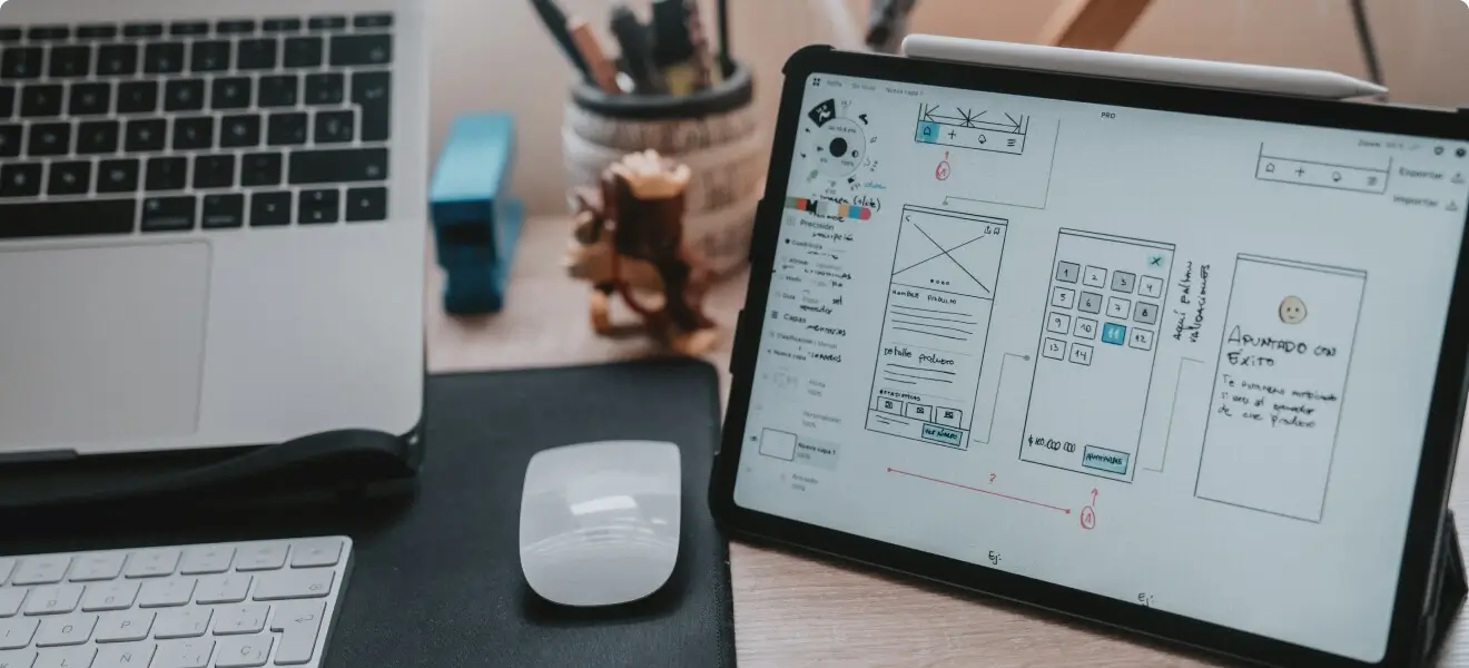
Because the industry is Travel & Tourism, the design and feel of the website are critical to its performance and reach. Unlike other websites, we opted to devote more effort to the website’s design process. Our design team worked on every minute aspect to match the expectations, from font selection to developing page loaders to designing layouts. Our design team met with the customer on a regular basis to gather/share ideas and implement them into the design. We spent a significant amount of time creating each page. We took a different strategy while designing mockups for all of the website pages. Instead of waiting for the full design phase to be finished, the approved design for a page is provided to the development team as soon as it is authorised.
Theme Selection
The previous website was simply an informative site providing tour details. But, the new website offers more than just a source of information. We chose Custom theme development since the website contains several components and bespoke designs.
Development Phase
We opted to undertake this as a custom theme development from start, therefore we had to consider which modules we would custom construct and which we would accomplish with third-party plugins. Because this is a custom theme, we utilised the Advanced custom fields pro plugin.
Besides from practicality, we opted to include subtle animations across the website to make it seem sleek and appealing. Hence, across the website, we followed a pattern of hover effects for Buttons, Pictures, Links, and so on.
Tours Module
Because the Tours modules are at the heart of this website, we had to decide whether to utilise third-party plugins or construct the module from the ground up utilising bespoke programming. We conducted considerable research on existing plugins that met our requirements. With the project timeframe in mind, we settled on the plugin method. We picked the “WP Travel” plugin for this project and decided to adapt it to our specifications and design.
We utilised the plugins’ basic configuration for post types and custom taxonomies for Categories, Locations, and so on, and to fit the custom design, we entirely changed the plugin using the plugin templates and plugin hooks in the right way as per the plugin specification.
We chose a four-column grid structure for Tour Listing pages, with an image, tour title, short description, and number of days and nights for each tour.
Every Tour detail page has a wealth of information on that tour. Hence, to show information better without requiring the user to scroll, we chose a tabbed design.
The Tour Detail page contains information on the tour’s Highlights, Gallery, Itinerary, FAQ, Visa & Passport, Tariff, How to Get There, and Currency. Each tour has its own devoted width video segment on this page.
WP Travel plugin has its own “Book Tour” option with an embedded form where users can write their questions and submit them to the admin. However, it had limits in terms of form fields and design. To satisfy our demands, we had to adapt this module and use a Contact Form produced with Contact Form 7 in this part.
And to Highlight specific tours in the front end, we added the capability for the admin to mark tours as “Featured” tours and the option to mark them as “Most Popular”, so that the Most popular tag appears wherever the tour is listed be it Homepage or Tours listing page.
WP Travel plugin has its own “Book Tour” option with an embedded form where users can write their questions and submit them to the admin. However, it had limits in terms of form fields and design. To satisfy our demands, we had to adapt this module and use a Contact Form produced with Contact Form 7 in this part.We utilised the ACF Pro plugin to create custom fields for showing information in tabbed view as well as additional information such as availability, duration, best time to visit, and so on.
Hotels Module
This Hotels module was created by creating a new custom post type named “Hotels” and a custom taxonomy called “Hotel Categories” to categorise them depending on geography. We created custom fields for star ratings, gallery, and hotel type using the ACF Pro plugin.
To match the style and feel, we utilised a similar four-column grid layout for the hotel listing page, but with different picture size than on the tour listing page.
Every hotel has its own dedicated page that contains information about the hotel such as its name, description, star ratings, gallery, and type.
Customer Reviews
The customer reviews module is a custom module that was created by creating a new custom post type named “Customer Reviews” with just minor modifications from the hotel module. We opted not to provide a category or even a detail page for review in this module. Despite the fact that Customer Reviews is an independent module, it just includes a single listing page with pagination. Each Review will include a Review Picture, a Review Title, a Review Description, the Customer’s Name, a Location, and star ratings.
Blog Module and CMS Pages
In comparison to the other listing pages, we took a distinct design approach for the Blog module. Instead of using a grid view, we used a list view. Each blog will have a Full-width blog featured picture, title, description, and categories in which it is placed on the blog listing page. Each blog post has social share buttons.
We applied the same design for the other CMS pages on the website as we did for the blog detailed page.
As part of the makeover, we created a layout for the whole website to ensure that all pages and posts follow the new design pattern.
About Bhutan Page
Despite the fact that it is only a CMS page, this page contains a lot of information. In addition, the About Bhutan page is dedicated to Bhutan and tourism.
Because the About Bhutan page had so much information, we made certain that viewers did not have to scroll excessively to read the text. Thus for the major titles, we utilised a Tabbed view, and for the inner titles, we used a vertical tabbed-like view.
Design your Itinerary Module
Despite the fact that we have several tours featured on the website, the client opted to allow clients to construct their own trip by selecting from a variety of locations and activities.
We opted to construct this module after finishing all of the others because it is large and requires special development.
This module provides customers with various options such as Number of Travellers (Adults, Students, Children, Kids), Date of Travel (From & To Dates), Purpose of Travel, the option to multi-select Places they would like to visit (Bumthang, Haa, Paro), the option to multi-select Activities they would like to engage in (Trekking, Camping, Rafting), and basic contact information such as Name, Email, and Phone number, etc
Because there are so many fields and choices to choose from on this form, presenting them all on one page as a standard form would not do credit to the distinct styles we have across the website. As a result, we chose to create this form as a Multi-Step form by dividing it into three phases based on the nature of the form field.
- Step 1 will feature a Place selection option with hover and on-click fill animations.
- Step 2 will feature an attractive user interface with hover and on-click fill animations for the Activities selection.
- Step 3 will have options for Name, Email, Phone, and Newsletter subscription. The number of travellers, date of travel, and purpose of travel fields will be included in all three phases because they can be modified at any moment.
After submitting the form, the user will be sent to a Thank you page with a Whatsapp and Skype link where they can click to commence a discussion with Raven Bhutan’s staff.
Once the form is successfully submitted, Admin will receive an email with the details supplied by the user, and the client will receive an email with the submitted details as well as a personalised PDF containing information about Bhutan, Raven Bhutan Tours, and the form information which they entered.
We encountered several challenges when designing this PDF producing module because it comprises numerous phases. We utilised mPDF to generate a PDF based on the information entered by the user and send it as an attachment in an email.
Besides from email, Admin may also verify form submissions in the admin backend.
Website Migration Process
We created the application on our server. However, because this is a website redesign, the prior website already contained a few blog articles and pages. While the previous website was only for information, we replicated all of the tours, pages, and articles on the new site before moving. Our SEO team additionally ensured that we did not lose any SEO benefits from the previous website by assessing the URL structure and implementing the required redirects.
After all of these SEO checks, we successfully transferred the new website to the live environment using the “All in One WP Migration” plugin.
After moving the website, we followed the processes outlined below.
- CSS and JavaScript fixes are being worked on.
- Testing for mobile responsiveness
Make the site’s appearance consistent across pages
- Begin with functional testing and bug fixes.
- Testing and fixes at the designer level
- We withdrew the testing form submissions that we had placed throughout the development and testing phases.
- Doing final live testing and bug fixes
Result
- Simple navigation in the header increased clicks by 200%.
- Improved tour listing and tour detail page user experience
- Improved user experience for hotel listing and detail page
- Backend is clean and well-structured for future client changes.
- Create your own Itinerary form that allows the user to customise their journey. This aided in the filtering and identification of more high-quality leads, resulting in higher lead quality.
- Capable of attracting more people through a better user journey.
- The website is ready for fresh marketing initiatives to bring in additional visitors.
MOAR Digital 360, as one of the leading website solution providers, can conceive, strategy, design, and construct your website requirements. We can offer efficient solutions for your company difficulties and goals, from integrating third-party resources to website construction.
If you need assistance with website design, website development, or digital marketing for your business, please contact us or phone us at +91 9840 364 360. We are delighted to collaborate with you.

 Software Product Engineering
 Dedicated Software Teams
 QA & Testing
 Application Development
 eCommerce
 Data Engineering
 AI & ML


